
Your Cart Total
{{price(cart.total || cart.subtotal_with_discount)}}
Add {{price(remainder)}} to qualify for free shipping*
You qualify for free shipping!*
Some items in your cart do not
qualify for free shipping.
Explore podcasts, videos, blogs, and webinars for inspiration and expert advice. Our extensive library is for everyone from beginners looking for a step-by-step guide through their first project or seasoned pros seeking fresh ideas and inspiration. We cover the topics you care about like technical tips and FAQs, interviews with industry stand-outs, and equipment comparisons and tours. Dive into our library and expand your knowledge today!
Go Back To ResourcesIn 1992, the Americans with Disabilities Act Accessibility Guidelines (ADAAG) was initiated. Since then, the Department of Justice has updated the ADA regulations (Title III), in effect as of March 15, 2011. The ADAAG requires all public places (except government buildings and churches) to install Americans with Disabilities Act (ADA)-compliant signage that includes tactile lettering, Grade II Braille, and in some cases, pictograms.
The ADA law language is very clear, as it places the responsibility for the conformance to the law on the owner of the signage project. Manufacturers, designers and those who act as agents of the project owner must be knowledgeable in the aspects of the accessibility guidelines presented in producing compliant signage.
The Standards for Accessible Design (SAD) define two categories of signs:
Signs that identify a permanent room or space (“identification” signs) are required to use raised characters; Braille signs must be properly mounted in a consistent location: on the wall, next to the door, on the latch or on the strike plate of the door. Informational and directional signs are not required to be mounted in a consistent location and only require visual characters.
Creating colorful, ADA-compliant signs for your customers is easier than you think. If you have a laser and rotary engraver, you can expand your signage business today with compliant ADA signs that every business uses! A rotary engraver is required to create the braille holes for your sign.
In this tutorial video, we’ll show you the steps on how to create ADA signage for your customers with a laser and rotary engraver. If you don’t have a laser, you can complete the entire process on a rotary engraver as well.
No, a Raster® license is not required to purchase Accent Raster® products.
For this method, you will need to use our low tack tape and our paired adhesive tape. For a more detailed tutorial on how to use this application method please refer to the below video.
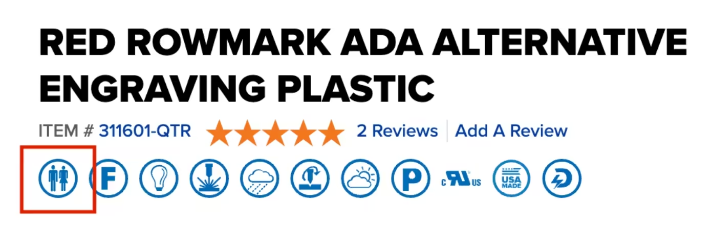
Look for the ADA-compliant/tactile icon on the product pages when shopping sheet materials on jpplus.com. This symbol indicates the product meets Americans with Disabilities Act (ADA) requirements. Our ADA Alternative engraving sheet is designed to specifically align with these compliance standards.
Watch the video below to review some of the ADA-compliant Rowmark sheet available for ADA signage.
Browse FAQ's and information by
Browse FAQ's and information by
Browse our
Our free resources are here to help you create confidently! You'll find everything from laser engraving ideas to sublimation heat press settings in our ever-expanding collection of blogs, how-to-videos, free artwork downloads, tech tips, and templates.
In addition to high-quality blanks, supplies, and equipment, our free resources help you work faster, learn new techniques, and take your personalization or signage business to the next level! Whether you're looking for tips and tricks for sublimation, laser engraving, rotary engraving, UV printing, DTF, or DTG - you've come to the right place!
Our video library offers creators and sign-makers quick tutorials, expert product demonstrations, and creative inspiration for laser engraving and more. Explore topics like:
New videos are uploaded regularly to keep up with new trends and technologies.
Design with confidence using our downloadable product templates and material-specific tech tips. Each resource includes:
Perfect for sublimation blanks, laserable materials, UV-print ready items, and more, these free downloads help reduce waste and improve production speed.
Looking for creative ideas for your laser engraver, UV-printer, or more? Our blog and featured project pages give you real-world applications and tips for:
Additional resources include:
Follow Us On
Social Media
for the latest trending products,
inspiration, tips, tricks and more!
@johnsonplasticsplus